
Website image optimization comes down to four settings: serve photos as WebP (or AVIF with a fallback), offer each image in a few widths so phones get small files, give every image a width and height, and lazy-load only the images below the first screen. Formats get most of the attention, though the other three settings usually cost a site more.
Which image optimization mistakes cost a business site the most?
Lazy-loading the main image and leaving images without dimensions. Both are common and each takes one attribute to fix. The first delays the biggest thing on the screen, which hurts the loading score in Core Web Vitals; the second makes the page jump while it loads. A better file format helps, but it is a slower and smaller win.
The 2025 Web Almanac from HTTP Archive shows how often this goes wrong. On mobile, the largest element on the first screen is an image on 76% of pages, so that one image largely decides how fast the page feels. Yet about 16 to 17% of pages lazy-load exactly that image, telling the browser to fetch it late. Only 17% of mobile pages with an image there mark it as high priority with fetchpriority="high". And 62% of mobile pages (65% on desktop) have at least one image with no set dimensions.
Formats move slowly by comparison. Among those main images, 57% are still JPG, 26% PNG, 11% WebP and 0.7% AVIF. The Almanac's own guess at the reason is the cost of migrating existing image pipelines and content libraries. That points to a sensible order of work for any owner: two attributes in the page templates this week, a format change when the pipeline allows it. If your site is built in code, these are settings a website development team puts into the templates once, so editors never have to think about them.
Should every image be lazy loaded?
No. Lazy-load the images a visitor has to scroll to, and load the first screen normally. Lazy loading on images that are already visible makes the browser wait before it fetches them, which slows down the moment the page looks ready. Below the fold it saves data with no visible cost.
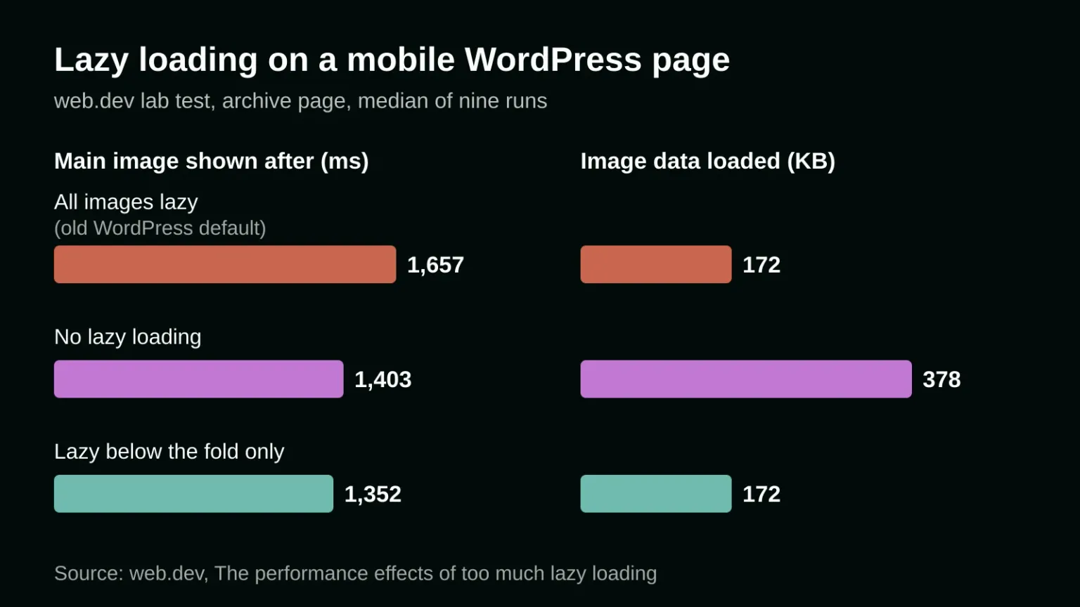
A test published on Google's web.dev site measured this on a demo WordPress site, at a time when WordPress also lazy-loaded the images on the first screen. On the mobile archive page, the main image appeared after 1,657 milliseconds with that default. Switching lazy loading off entirely brought it to 1,403 ms, but more than doubled the image data, from 172 KB to 378 KB. Lazy-loading only the images below the fold gave 1,352 ms with the original 172 KB. That's 18% faster than the default, and slightly faster than no lazy loading at all, probably because the off-screen images no longer competed with the main one for bandwidth.
Some owners worry that lazy images will appear blank as people scroll. Chrome starts loading them well before they come into view: 1,250 pixels ahead on fast connections and 2,500 pixels on 3G or slower. On a normal page, they're ready by the time anyone gets there.
A practical rule for a business site: the hero image, the logo and anything else visible without scrolling on a phone load normally, and the hero also gets fetchpriority="high". Everything else gets loading="lazy". If a plugin or theme adds lazy loading for you, check what it does to the first image, because some apply it to every image on the page.
What is the best image format for a website?
For photos, WebP is the safe default and AVIF is the smaller option if you add a fallback. Use SVG for logos, icons and diagrams, and PNG only where you need exact, lossless pixels. JPEG still works everywhere, but at the same quality it gives you a heavier file than either modern format.
MDN, the reference most web developers use, calls WebP an "excellent choice" with "much better compression than PNG or JPEG," and says AVIF "offers slightly better compression" but is not quite as well supported and does not support progressive rendering. Its advice for AVIF is to include a fallback with the <picture> element, which lets the browser take the first format it understands.
A sensible position: don't convert hundreds of old images by hand. If your CMS or image service can produce AVIF and WebP automatically, turn both on and you're done. If it can't, convert the images that matter (the hero of each main page, product photos) to WebP and leave the archive alone. Old blog posts that few people open can wait.
What size should website images be?
As wide as the space they fill on screen, times the screen's pixel density, and no wider. An image shown 400 pixels wide on a phone with a 2x screen needs an 800-pixel file. Offer a few widths and let the browser choose, using the srcset and sizes attributes.
In MDN's own example, the 800-pixel version of a photo is 128 KB and the 480-pixel version 63 KB, so a phone that only needs 480 pixels saves 65 KB on one picture. Across a product grid of 20 photos, that is about 1.3 MB a phone never needed to download.
The detail most guides skip is the sizes attribute. It tells the browser how wide the image will be displayed before the layout exists. If it's missing or wrong, for example a thumbnail in a three-column grid described as full-screen width, the browser picks a file several times bigger than needed, and the page still looks perfect, so the waste goes unnoticed until someone opens the browser's network panel. Ask your developer to check sizes on the templates with grids and cards, since that is where it's usually wrong.
Different crops for different screens are a separate decision. MDN calls this art direction: a wide hero photo on desktop and a tighter crop on a phone, so the subject doesn't shrink to a dot. It's done with the same <picture> element, and a designer should choose the crops.
Why do images make the page jump while it loads?
Because the browser doesn't know how tall an image is until the file arrives. Without width and height in the code, it lays the image out at zero height, then pushes the text down when the image loads. Setting width and height, or a CSS aspect ratio, reserves the space in advance.
This is the fix with the best effort-to-result ratio in website image optimization, and the Almanac says that leaving browsers to guess image sizes makes images "one of the most persistent and preventable contributors" to layout shift. web.dev recommends width and height on every image and notes that lazy loading makes it matter more, since a late image with no reserved space moves everything below it. If your Core Web Vitals report shows a layout shift problem, look here first. For how to decide which metric to tackle, see which Core Web Vital to fix first.
A website image optimization checklist for your developer
- The first visible image on each template loads normally and has fetchpriority="high".
- Every other image has loading="lazy".
- Every image has width and height, or an aspect ratio in CSS.
- Photos come in several widths through srcset, with a sizes value that matches the real layout.
- Photos are served as WebP, or AVIF with a WebP or JPEG fallback, ideally converted automatically on upload.
- Logos and icons are SVG.
The last point on automation matters most for sites where editors upload photos straight from a phone. If the system resizes and converts on upload, the checklist stays true a year after launch; if it relies on people remembering, it won't. That's one reason the choice of platform matters, as covered in static site, WordPress or website builder. If you'd like a second opinion on how your own images load, talk to us about your site. You can read about onlyspell first if you want to know who would answer.
Frequently asked questions
Do all browsers support WebP?
Yes, the major ones do. MDN lists WebP support in Chrome, Edge, Firefox, Opera and Safari. AVIF is supported by the same browsers, but MDN still recommends a fallback for it through the picture element.
Should I lazy-load the hero image on my homepage?
No. The hero is usually the largest element on the first screen, so lazy-loading it delays the moment the page looks ready. In a web.dev test on a WordPress page, lazy-loading visible images made the main image appear at 1,657 milliseconds, against 1,352 when only the images below the fold were lazy.
How many sizes of each image do I need?
Enough that a phone, a tablet and a large desktop screen each get a file close to the width they display, counting high-density screens. In practice that means a handful of widths per photo, listed in srcset. Your CMS or image service should create them automatically rather than by hand.
Sources
If you still need additional help in developing and designing your website, our magic is here to help. Contact us today, and our wizards will help you immediately with your digital marketing needs!