
Above the fold on a landing page, put the four things a visitor needs before deciding to stay: a headline that says what you offer, one line on who it's for, a single clear next step, and one piece of proof. That first screen still gets more than half of all viewing time. On a phone, it's also smaller than most designers assume.
The usual checklists stop at "headline, subheadline, CTA, hero image". This article covers the part they skip: how much room the first screen really has on a phone, what eats that room, and why the hero you choose decides how fast the page feels. It's a UX and UI design question first and a technical one second, and the two meet right at the fold.
Does above the fold still matter in 2026?
Yes. In a Nielsen Norman Group eyetracking study published in 2018, with 120 participants, the first screenful got 57% of viewing time and the second got 17%. People do scroll, far more than in 2010, but attention still drops sharply below the first screen. What sits there decides whether they keep going.
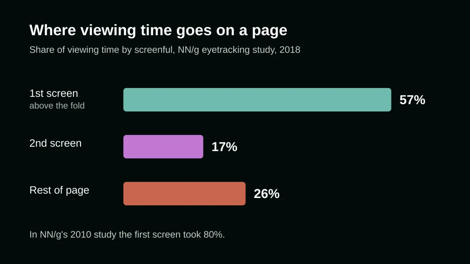
The trend is worth reading in both directions. In NN/g's 2010 study the first screen took 80% of viewing time, so the drop to 57% shows people have learned to scroll long pages. The same report still advises keeping major calls to action above the fold, because 74% of viewing time happened in the top two screens combined.
Google said something similar back in January 2012, when it announced a change to how it ranks pages with heavy ads at the top: "Rather than scrolling down the page past a slew of ads, users want to see content right away." The algorithm targeted sites that went to excess, and Google said it noticeably affected less than 1% of searches. The same logic applies to a landing page: the first screen should show what the visitor came for.
Where is the fold on a phone?
Lower than the screen size suggests. StatCounter's figures for October 2026 put 414×896 as the most common phone screen worldwide, at 12.67%, followed by 360×800 at 8.57%. From that height, subtract the browser's address bar and toolbar, then anything your own site pins over the page. What's left is your real first screen.
Two common design choices shrink it further.
The full-screen hero that hides its own button
Designers often size the hero section to fill the screen with the CSS unit 100vh. MDN notes that on phones, browsers often hide part or all of the address bar once someone starts scrolling, and that the default vh unit is measured against that larger, bars-hidden viewport. When the page first loads, the bars are showing. So the bottom of a 100vh hero is cut off on arrival, and the bottom is exactly where the button usually sits.
The fix is small. Size the hero with the small viewport unit (svh), which MDN describes as filling the screen without hiding content while the browser bars are visible. Or don't make the hero full height at all, and let the top of the next section peek into view. That peek also answers NN/g's warning about "false floors": a first screen that looks finished tells people there's nothing more to see.
The cookie notice sitting on your offer
On a desktop a consent notice is a strip. On a phone it can cover a large part of the first screen, right on top of your headline. Google's web.dev guide on cookie notices says that on mobile they take up a larger share of the screen, that a long block of notice text can become the page's largest element, and that notices at the top of the screen are a very common cause of layout shift.
Keep the notice text short, place it at the bottom of the screen, and make sure it overlays the page instead of pushing content down. Then look at your landing page on a real phone with the notice open. That's what a first-time visitor sees.
What should the first screen of a landing page show?
A headline naming the outcome, a one-line subheadline saying who it's for, one primary call to action, and one trust signal such as a client logo, a rating or a short quote. If the visitor came from an ad or an email, the headline should repeat that promise in plain words.
Everything else is a candidate for the second screen. A second button with equal weight splits the choice. Navigation links pull people off a page that exists for one action. A paragraph of copy above the button pushes the button down, and on a 360-pixel-wide screen a three-line headline can already do that alone. Write the headline for the phone first, then check it on desktop.
The button needs a label that says what happens next ("Get a quote", "Book a call") and enough size to hit with a thumb. Our guide to tap target size on mobile websites has the numbers. If the next step is a form, the form itself can sit lower on the page, as long as the button above the fold jumps straight to it. How that form is built matters as much as where it sits: web form design that gets more completions covers the fields, labels and errors.
Should you put a slider or carousel above the fold?
Usually not. Jakob Nielsen's 2013 report on auto-forwarding carousels describes a test on Siemens' UK homepage where a large discount sat in a rotating panel. Because the panels changed every five seconds, the offer was on screen only about 20% of the time, and a participant looking for exactly that deal gave up and decided there wasn't one.
A carousel also makes the first screen slower. The first slide is usually a big photo, and the browser has to fetch it before the page looks ready. Pick your strongest message, give it one static image, and move the other slides down the page as ordinary sections.
How does the first screen affect page speed?
Google's Largest Contentful Paint (LCP) times how long the largest image or text block on the first screen takes to appear. web.dev counts it as good at 2.5 seconds or less for 75% of visits. On a landing page that element is usually the hero image or the headline, so the design choice is also a speed choice.
One common mistake is easy to check. Lazy loading tells the browser to delay an image until it's about to scroll into view, which is right for images further down and wrong for the hero. In a web.dev study, pages using built-in lazy loading had a median 75th-percentile LCP of 3,546 ms, against 2,922 ms for pages without it. That comparison is a correlation, but the same authors ran an A/B test on WordPress archive pages: turning lazy loading off improved LCP by about 13% on desktop and 15% on mobile. Their recommendation was to load images above the fold eagerly. If your site builder lazy loads every image, ask for the hero to be excluded. That's a job for the development side of the project.
A five-minute check of your own landing page
Open the page on a phone, not a resized desktop window. Before you scroll, write down what you can see. Can a stranger tell what you offer and for whom? Is the button fully visible with the cookie notice open? Does anything move or rotate on its own? Does the bottom of the screen hint that the page continues? Then reload on a slow connection and watch which element arrives last. If it's the hero photo, start your speed work there.
onlyspell designs and builds websites and systems, and the first screen is where a lot of that design work gets decided. If your landing page brings visitors but not enquiries, talk to us about your project.
Frequently asked questions
How many pixels is above the fold?
There's no single number, because it depends on the device and the browser. StatCounter's October 2026 data shows 414×896 and 360×800 as the two most common phone screens, and the browser's own bars take part of that height. Test on real devices rather than designing for one fixed fold line.
Does the call to action have to be above the fold?
For a landing page with one goal, put at least one clear call to action on the first screen. Nielsen Norman Group recommends keeping major calls to action above the fold, since the first screen gets most viewing time. A longer page can repeat the button further down for people who read first.
Is a full-screen hero image a bad idea?
Not by itself, but it carries two risks. A hero sized with 100vh can hide its own button behind the phone's browser bars on first load, and a large photo is often the element that decides the page's loading score. Size it with svh and don't lazy load it.
Sources
- Nielsen Norman Group: Scrolling and Attention (Therese Fessenden, 2018)
- Nielsen Norman Group: Auto-Forwarding Carousels and Accordions Annoy Users and Reduce Visibility (Jakob Nielsen, 2013)
- Google Search Central: Page layout algorithm improvement (2012)
- StatCounter: Mobile screen resolution stats worldwide
- MDN: CSS length units, viewport-percentage lengths
- web.dev: Best practices for cookie notices
- web.dev: Largest Contentful Paint (LCP)
- web.dev: The performance effects of too much lazy loading
If you still need additional help in developing and designing your website, our magic is here to help. Contact us today, and our wizards will help you immediately with your digital marketing needs!