
Mobile-first design means the phone layout is drawn first and the desktop layout grows out of it. In practice that changes four things: the page gets a single order of sections, navigation and hover effects have to work without a mouse, forms open the right keyboard, and the desktop version becomes an expansion of the phone version. Each one shows up as a concrete difference in the mockups a designer asks you to approve.
Mobile-first is a way of working in UX and UI design, the part of a website project that onlyspell calls its Love Spell. The facts below come from Google Search Central, Nielsen Norman Group, MDN and StatCounter. The rest is the practical picture: what changes when a designer hands you a phone mockup before the desktop one.
What is mobile-first design?
Mobile-first design is a process where the smallest screen is designed first and larger screens add columns, space and detail on top. Luke Wroblewski named it in a post called "Mobile First" on November 3, 2009. Responsive design is the result people see; mobile-first is the order in which it gets made.
Wroblewski gave three reasons in 2009: mobile was growing fast, small screens force focus, and phones offer capabilities such as location and multi-touch that many desktop browsers lacked. The second reason is the one that still matters for a business site. In his words, mobile devices require teams "to focus on only the most important data and actions".
The growth argument has played out. StatCounter's worldwide figures for October 2026 put mobile at 59.9% of web traffic, desktop at 38.51% and tablets at 1.59%. Your own split can be very different, and it is worth checking in your analytics before anyone argues about it.
What actually changes when a design starts from the phone?
The content gets ranked, because a 390-pixel-wide screen shows one thing after another. Menus and hover effects get rebuilt for fingers. Forms get matched to the phone keyboard. Then the desktop layout is planned as what the extra width adds, instead of the phone layout being whatever is left after squeezing the desktop.
The page gets one order
A desktop layout lets you avoid a decision. Put the service description on the left and three client quotes on the right, and both feel "near the top". On a phone those two columns become one, and something has to come first. When the desktop is designed first, the right column usually just drops below the left one, so the quotes end up under a long block of text, far from where a visitor decides whether to stay.
Starting from the phone forces the question early: after the headline, does a visitor need the price range, a quote from a client, or the list of what is included? That ranking then carries back to the desktop, where it decides what sits highest and largest. Having that conversation over the first sketch is much cheaper than having it after the desktop pages are finished.
Navigation becomes a decision
On a phone there is no room for seven links in a row, so the default is to hide them all behind a menu icon. That has a measurable cost. In a 2016 Nielsen Norman Group study, people used the navigation on a mobile site that showed some links and hid the rest 89% of the time, against 44% on a site that hid everything behind a menu. A third site with all its links behind a Menu button reached 56%. People also found the navigation sooner on the first site than on the fully hidden one: after 24 seconds on average, against 33.
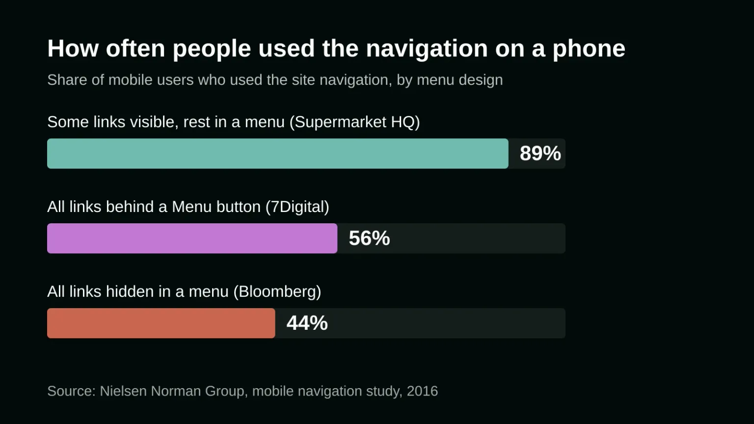
NN/g recommends visible navigation when there are four or five top-level choices, and a mix of visible and hidden links when there are more. For a business site that usually means two or three of the most requested pages stay on screen next to the menu button. The guide to designing a website menu visitors understand covers how to choose and label those links.
Hover stops being a feature
Anything that only appears on mouse-over is invisible on a phone. MDN's documentation of the CSS hover media feature says many mobile devices can't hover conveniently and only emulate it with "an inconvenient long tap". That affects portfolio grids where the project name appears on hover, tooltips that explain a price, and drop-down menus that open when the pointer rests on them.
Designing from the phone means these get a visible label, a tap or an icon from the start. On desktop the hover effect can still be added as an extra, and developers can limit it to devices that really hover with a hover media query.
Fingers replace the cursor
A cursor is a point; a fingertip covers an area and hides what it presses. Buttons and links need enough size and space between them, and the main actions belong where a thumb reaches them without stretching. The exact minimum sizes from WCAG 2.2 are in the guide to tap target size for a mobile website.
Forms open the right keyboard
Typing on a glass keyboard is slow and easy to get wrong, so a mobile-first form asks for less and picks the keyboard for each field. An email field built as an email input opens a keyboard with the @ sign, and a phone field built as a telephone input opens a number pad. For codes or quantities, the inputmode attribute set to "numeric" shows digits only. MDN notes that inputmode only changes the keyboard and does not check what was typed, so it is paired with the matching input type where one exists.
Desktop becomes the expansion
In the code, the phone styles become the default and wider screens add rules with min-width media queries. In the design, the desktop version is where you add a second column, show more of the menu, enlarge the photos and put related content side by side. The risk to watch is a desktop page that is simply the phone layout stretched wide, with one long column of text and huge empty margins. A good desktop design uses the extra width on purpose.
None of this works unless the page tells the phone how wide to draw it. Without a viewport meta tag, MDN explains, a phone may render the page in a virtual window around 980 pixels wide and shrink it down, so media queries written for narrow screens never apply. A single viewport tag set to width=device-width in the page head fixes it.
Is mobile-first design the same as Google's mobile-first indexing?
No. Mobile-first design is how a page gets drawn. Mobile-first indexing is how Google reads it: Google uses the mobile version of a page, crawled with its smartphone agent, for indexing and ranking. Google announced on October 31, 2023 that the move to mobile-first indexing was complete.
The two meet in one place: what you cut from the phone version. A designer who removes a long paragraph or an FAQ from the phone layout to save space has removed it from what Google indexes too. Google's own guidance says the mobile site should contain the same content as the desktop site, and suggests accordions or tabs to save space instead of deleting content. It also asks for the same title, meta description, structured data and image alt text on both versions, and warns against loading primary content only after a visitor taps or clicks something. A mobile-first design can reorder and fold content as much as it likes, as long as all of it stays on the phone page.
How to review a mobile-first design as a business owner
You don't need to read code to check whether a design really started from the phone. Ask for the phone mockups before the desktop ones and go through this list:
- Read the phone page top to bottom and say the order of sections out loud. If the order doesn't match what a new visitor needs to know first, change it now, before the desktop is drawn.
- Look at the first screen of the phone version: is the main action visible without scrolling?
- Find every place where something appears "on hover" in the desktop version, and ask what replaces it on a phone.
- Count the links hidden behind the menu icon. If the two pages people ask about most are among them, ask for them to be shown next to the icon.
- Open the contact form on your own phone once it is built, and check which keyboard comes up in each field.
- Compare the phone and desktop versions of one page and make sure nothing was dropped from the phone, only folded or moved.
- Look at the desktop version for long lines of text and large empty areas: signs that the phone layout was stretched instead of expanded.
If you would like a second pair of eyes on a design or a site that works well on desktop and poorly on phones, tell us about your project and we'll look at it with you.
Frequently asked questions
Is mobile-first design the same as responsive design?
They are related. Responsive design is a page that adapts its layout to the screen it is shown on. Mobile-first is one way of building it: the phone layout is designed and coded first, and larger screens add to it.
Does mobile-first design make the desktop version worse?
It shouldn't. In a mobile-first process the desktop version is planned as an expansion, with extra columns, a fuller menu and larger images. It only gets worse when the phone layout is stretched across a wide screen without anyone designing what the extra space is for.
Does Google rank the mobile version of my website?
Yes. Since Google completed mobile-first indexing in 2023, it uses the mobile version of a page, crawled with its smartphone agent, for indexing and ranking. Content that exists only on the desktop version of a page may not count.
Sources
- Luke Wroblewski: Mobile First (November 3, 2009)
- StatCounter Global Stats: Desktop vs Mobile vs Tablet Market Share Worldwide
- Nielsen Norman Group: How to Make Navigation (Even a Hamburger) Discoverable on Mobile (2016)
- MDN: hover media feature
- MDN: inputmode attribute
- MDN: Viewport meta element
- Google Search Central: Mobile site and mobile-first indexing best practices
- Google Search Central Blog: Mobile-first indexing has landed (October 31, 2023)
If you still need additional help in developing and designing your website, our magic is here to help. Contact us today, and our wizards will help you immediately with your digital marketing needs!