
A website needs a contrast ratio of at least 4.5:1 between normal text and its background, and 3:1 for large text. Buttons, form borders and focus outlines need 3:1 too. Low contrast is also the most common accessibility failure on the web: WebAIM found it on 83.9% of one million home pages in February 2026.
What contrast ratio does a website need to pass WCAG?
Normal text must reach 4.5:1 against its background at level AA of WCAG 2.2. Large text, meaning at least 18 point or 14 point bold (roughly 24 and 18.5 CSS pixels), needs 3:1. The W3C treats these as hard thresholds and says not to round: a ratio of 4.499:1 fails.
That last rule matters more than it looks, and it is where most "it looks fine" arguments end.
The grey that fails by 0.02
Run the WCAG formula on pure white and a neutral grey, and the cutoff is sharp. #767676 scores 4.54:1 and passes. #777777, one step lighter, scores 4.48:1 and fails. #767676 is the lightest neutral grey that clears 4.5:1 on white. The popular "light grey for secondary text" choice, #999999, lands at 2.85:1.
Now the catch nobody mentions when they hand you that magic number. It only works on white. Put the same #767676 on a near-black #121212 and it falls to 4.12:1, a fail. On pure black it passes at 4.62:1. The ratio depends on both colours, so a grey that is safe in a light theme can break in a dark one. A dark site's main text is rarely the problem, since white on near-black clears the bar by a wide margin. The failures hide in the secondary text: captions, dates, footer links, form hints. On #121212, #888888 gives 5.29:1 and passes.
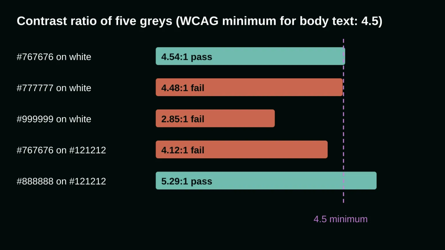
So treat secondary text as its own colour token per theme. One "muted grey" shared by both themes is how a site ends up passing in light mode and failing in dark.
Does placeholder text need enough contrast?
Yes. The W3C says the contrast rule applies to text in the page, including placeholder text. Only inactive components, such as a disabled control, pure decoration, incidental text and logotypes are exempt. A pale grey "Your email" hint inside a field has to reach 4.5:1 like any other text.
Designers like faint placeholders because they stop the hint from looking like something the visitor already typed. That is a fair worry. The fix is a visible label above the field and a placeholder that is readable but still distinct, for example a shade or two lighter than the typed text, not a different league of pale.
Do buttons, form fields and focus outlines need contrast?
Yes, at 3:1. Success criterion 1.4.11, Non-text Contrast, covers the visual information needed to identify interface components and their states. When a text input relies on its border to look like an input, that border must reach 3:1 against the adjacent colour.
A common offender is the pale 1px field border. #cccccc on white measures 1.61:1, which is about half of what the rule asks. #949494 gets to 3.03:1. A border is not required when the control has other clear cues, such as visible text, but outlining the field is the safer pattern.
Focus indicators follow the same 3:1 rule when you style them yourself. The browser's default focus ring is exempt, but it still has to be visible. And a hover colour that you add is treated as an extra, not as the only signal. This is also where brand colours get tricky: a bright accent that reads fine as large text or a graphic can still be too light for a small label or a thin outline.
Why a checker can say "pass" while the text is hard to read
Automated tools have blind spots. Deque's axe rule does not report on text that sits on a background image, and it says that with gradients, pseudo-elements and overlapping elements, transparency is harder to detect and account for. A hero headline over a photo is the classic case: the checker stays silent, so nobody looks.
Check those spots by hand. Sample the lightest and the darkest area behind the text, and test the worse of the two. If it fails, a solid or semi-opaque panel behind the text fixes it faster than recolouring the photo.
How to fix contrast without redoing the brand
Change the failing tokens, not the whole palette. Keep the brand colour where it works: large headings, icons, decorative shapes. Add a darker (or, in dark mode, lighter) shade of it for small text and thin lines. Then give every theme its own secondary text colour and its own border colour, and test each pair rather than trusting one grey.
Start with the places visitors act: form fields, buttons, links in the footer, error messages and the cookie banner. Use a contrast checker and read the ratio to two decimals. If the palette itself is the problem, that is a job for digital design work covering UX, UI and visual identity, which is what the love spell at onlyspell is about.
If you would rather have someone check your own pages, talk to us about your project.
Frequently asked questions
What is the minimum color contrast ratio for a website?
WCAG 2.2 level AA asks for 4.5:1 for normal text and 3:1 for large text, which is at least 18 point or 14 point bold. Interface parts such as input borders and focus outlines need 3:1. Ratios must not be rounded up to pass.
Is dark mode automatically accessible?
No. White text on a near-black background usually passes easily, but secondary greys often do not. #767676 reaches 4.54:1 on white yet only 4.12:1 on #121212. Each theme needs its own checked pair of colours for muted text, borders and placeholders.
Do logos and disabled buttons have to meet the contrast rule?
No. WCAG exempts text that is part of a logo or brand name, and inactive components such as a disabled control. Placeholder text, hover text and images of text meant to be read are not exempt and must meet the ratio.
Sources
If you still need additional help in developing and designing your website, our magic is here to help. Contact us today, and our wizards will help you immediately with your digital marketing needs!